Design Projects Coding Projects Experiments / Arts Writing About Resume / CV ↗

Visualizing Value

Which American colleges maximise economic mobility while remaining accessible and affordable?

An information-visualisation project for INF451 at the Faculty of Information. Using Opportunity Insights’ longitudinal data on 2,400+ US colleges, I built a set of interactive Tableau views that put three things on the same canvas: what a college costs low-income families, how many of them it admits, and where its graduates end up.

The goal was not a ranking but a lens: a way to see the trade-offs between affordability, access and outcomes, and to find the rare institutions that manage all three.

Timeline
Nov – Dec 2025Course project
Role
SoloData analysis, visualisation design, storytelling
Course
INF451 Visualization DesignProf. Anthony Gray & Aurora Mendelsohn
Tools
TableauOpportunity Insights (Chetty et al.)Data cleaning in spreadsheets
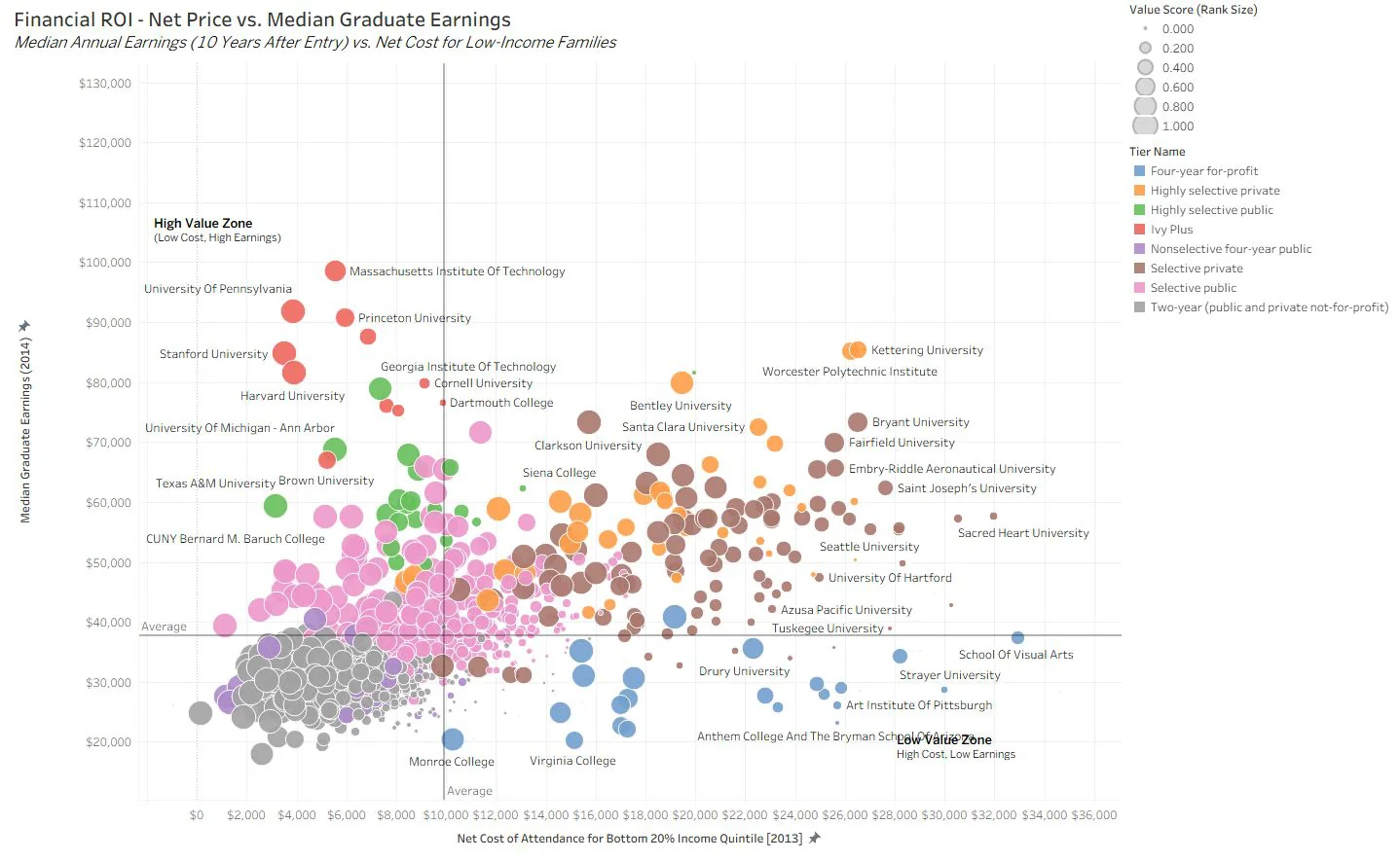
Scatter plot of net cost versus median graduate earnings for 2,400 US colleges, coloured by institution tier
Financial ROI: net price for low-income families against median earnings ten years after entry. Top-left is the high-value zone.

01.Research Question

Which American colleges deliver the best overall value when balancing affordability, access and outcomes?Guiding question
AffordabilityLow net cost of attendance for families in the bottom income quintile.
AccessA high share of the student body drawn from the poorest 20% of families.
OutcomesStrong graduate earnings and a high rate of economic mobility.
Sub-question 1How do institutions trade off between the three dimensions?
Sub-question 2Which types of colleges, public or private, selective or not, achieve the best balance?
Sub-question 3Are there geographic patterns among high-value institutions?
Sub-question 4What can an individual student learn about return on investment?

02.Data

The dataset is Opportunity Insights’ mobility report cards (Raj Chetty et al., Harvard), which link federal tax records to college attendance records for cohorts born 1980–1982, roughly the classes of 2000–2004, across more than 2,400 US colleges.

Social mobility
Rate of students moving from the bottom 20% income bracket to the top 20%.
Access
Percentage of the student body from the poorest 20% of families.
Outcomes
Median student earnings measured ten years after starting college.
Cost
Net cost of attendance for the bottom income quintile (2013).

Limitations I kept in view

Lag timeCohorts graduated around 2002–2005; today’s tuition and labour market differ.
Tax filers onlyThe informal economy and undocumented students are potentially missed.
System aggregationSome systems (CUNY, Penn State) report as one entity, masking campus differences.

03.Visualisations

Four linked Tableau views, each answering one sub-question. Colour encodes institution tier or region; size encodes a composite value score; reference lines mark the national averages so every quadrant reads as a verdict.
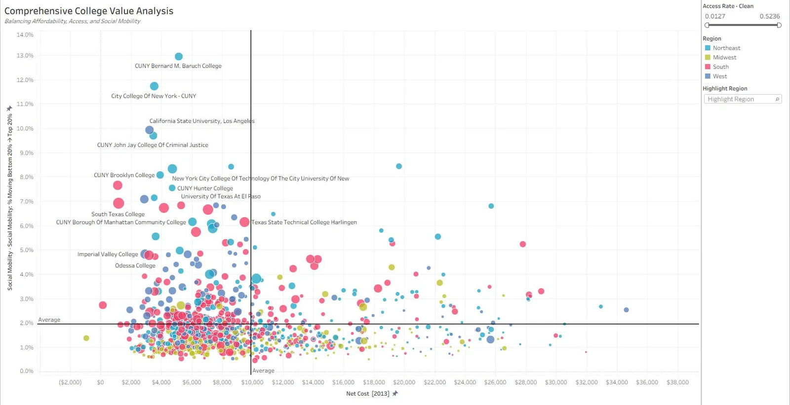
Scatter plot of net cost versus social mobility, coloured by region, with CUNY and Cal State campuses labelled at the top
Comprehensive value: net cost against mobility rate, coloured by region. The upper-left cluster is almost entirely CUNY and Cal State campuses.
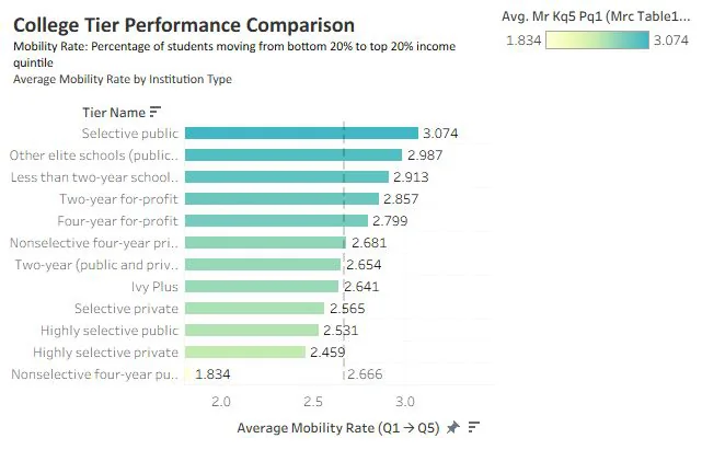
Horizontal bar chart of average mobility rate by institution tier, selective public highest at 3.074
3.07%
average mobility rate at selective public universities, the highest tier
1.83%
nonselective four-year public, the lowest

Tier comparison: average mobility rate by institution type, with the overall mean as a reference line.
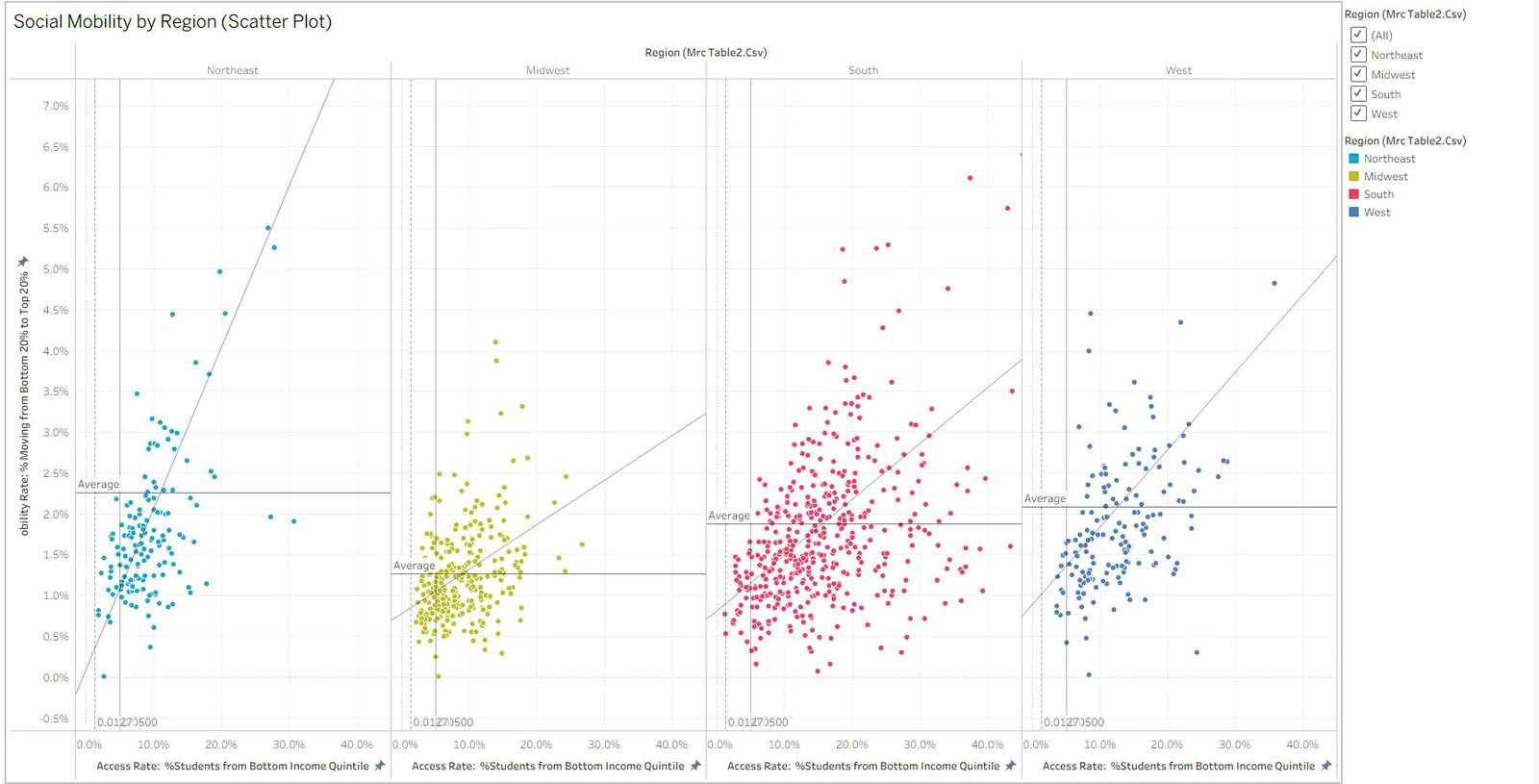
Four small-multiple scatter plots of access rate versus mobility rate for the Northeast, Midwest, South and West
Small multiples by region: access rate against mobility rate with a trend line per region.

04.Key Findings

1 · Public urban universities leadCUNY and Cal State systems reach exceptional mobility rates of 7–13% while combining affordable net costs ($5K–10K), high access (20–30%) and strong outcomes. Baruch College, City College of New York and Cal State LA are the standouts.
2 · Type matters, but not simplySelective publics show the highest average mobility (3.07%). Elite privates deliver strong outcomes but low access, so limited social impact. For-profits show the weakest return despite serving some low-income students.
3 · Geography reveals disparitiesNortheast institutions dominate the best-value space. The South has high access but lower mobility, which hints at systemic barriers. Coastal regions outperform the interior.
4 · The triple achievement is rareAlmost no college succeeds at all three: affordable, accessible and high-mobility. Most institutions face real trade-offs.
7–13%
mobility rate at CUNY and Cal State campuses
$5–10K
net cost for bottom-quintile families at those campuses
20–30%
of their students come from the poorest 20%

05.Beyond the Data

Individual return on investment is not the same as social mobility: a college can be personally lucrative but socially limited, as the elite privates show. For societal impact, access matters as much as outcomes. And context matters: regional economies and labour markets shape mobility potential, and location affects both opportunity and how it is measured.

A good visualisation of this data is a lens, not a league table. It should make the trade-offs legible rather than hide them behind a single rank.What I took away